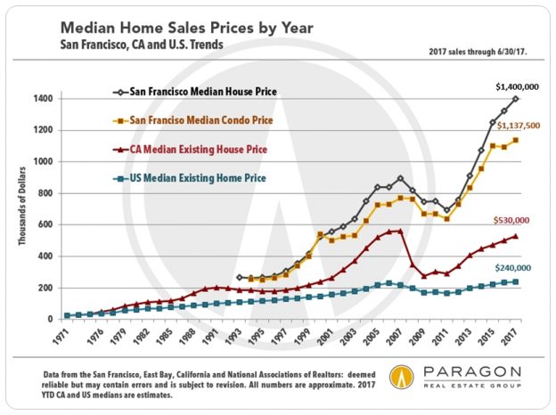
Owners in the city (and the nation) are getting older, and selling their houses ever more infrequently. And virtually no new houses are being built within SF itself.

Condo sales significantly outnumber house sales in SF, and the supply of condos available to purchase has surged with new project construction. This has made that market segment somewhat less heated; condo owners also tend to sell more frequently than house owners. However, the condo market in the city is much more expensive than in other counties.
————————————————————
Ultra-Luxury House Sales in San Francisco
Houses Selling for $5 Million & Above
A quick look at the very highest end of the SF market. Though other districts, such as the greater Noe-Eureka-Cole Valleys district, have increasingly surged into the luxury home segment, when it comes to the realm of the really big, most expensive houses, the district comprised of Pacific & Presidio Heights, Cow Hollow and Marina dominates with 75% of sales. House sales there can exceed $30m, though that is still very rare.

————————————————————
Bay Area Home Price Appreciation
per the S&P CoreLogic Case-Shiller Index
Earlier in this report, it was mentioned that median price changes can sometimes be unreliable as indicators of actual appreciation. However, the S&P Case-Shiller Home Price Index measures appreciation using its own special algorithm tracking resales of the same home, and it does not use median sales prices. This first chart below, based on Case-Shiller, is a simplified, smoothed-out look at the up and down cycles over the past 33 years in the higher end of the Bay Area real estate market, which predominates in most of the city, Marin, San Mateo and areas like Piedmont, Diablo Valley and Lamorinda. Because it covers 5 counties, it merges the differences between their separate markets into a single trend line.

This second Case-Shiller chart illustrates how homes in different price segments around the Bay Area have recently been appreciating at considerably different rates. C-S divides all the Bay Area house sales into thirds by number of sales: low-, mid- and high-price. As illustrated in the lower green line, the higher-priced segment went flat in appreciation in 2016, but then jumped back to life in 2017. The most affordable price segment (top blue line) has been experiencing the highest pressure of buyer demand and competitive bidding, and since April 2016, has out-appreciated the most expensive segment, 12.4% to 4.3%, i.e. almost triple the rate of increase. The middle price segment (gold line) has been in between, appreciating by 7.8%.
These dynamics are generally true within each county, as buyers, somewhat desperately, search for homes they can still afford, in the area they wish to live.
The numbers on this chart all refer to a January 2000 home price of 100. Thus 262 signifies a price 162% higher than in 2000.

————————————————————
Months Supply of Inventory (MSI)
The lower the months supply of inventory, the higher the demand as compared to the supply of homes available to purchase, i.e. lower MSI equals a hotter market. The entire Bay Area has been experiencing very, very low MSI figures recently, with San Mateo at rock bottom. (Its median house sales price has just recently been exceeding the median price in the city.) Alameda and Contra Costa Counties, generally offering considerably more affordable home prices than Silicon Valley, San Francisco and Marin are also at extreme lows.
Within SF itself, the MSI for houses alone, and especially in the more affordable neighborhoods, is substantially lower than the MSI for condos, though both have been very low since spring began.

————————————————————
Mortgage Interest Rates
Since the election, interest rates have seen a wild ride, first up and then down. As of the end of August, rates hit their lowest point so far in 2017, a significant financial advantage for buyers.

Please let us know if you have questions or we can be of assistance in any other way. Information on neighborhoods not included in this report is readily available.
All our many Bay Area real estate analyses can be found here: Paragon Market Reports
Over the past 12 months, Paragon sold more San Francisco residential and multi-unit residential real estate than any other brokerage. (Sales reported to MLS per Broker Metrics.)
————————————————————
These analyses were made in good faith with data from sources deemed reliable, but may contain errors and are subject to revision. It is not our intent to convince you of a particular position, but to attempt to provide straightforward data and analysis, so you can make your own informed decisions. Median and average statistics are enormous generalities: There are hundreds of different markets in San Francisco and the Bay Area, each with its own unique dynamics. Median prices and average dollar per square foot values can be and often are affected by other factors besides changes in fair market value. Longer term trends are much more meaningful than short-term.
© 2017 Paragon Real Estate Group
| Paragon Real Estate Group www.paragon-re.com/ |
|