Category Archives: San Francisco Real Estate Blog

San Francisco’s Hottest, Most Competitive Neighborhood Market

A Shift from Prestigious, Expensive, High-Tech and Hip
to Normal, Middle-Class, Working-People Affordable

October 2016 Paragon Market Report
Since the market recovery began in 2012, various districts have taken the lead as the hottest markets in San Francisco: The affluent and prestigious Noe-Eureka-Cole Valleys district and Pacific Heights-Marina district led the recovery out of recession. Later South Beach/SoMa, Hayes Valley and, especially the Mission, went white hot as the high-tech boom surged (though, honestly, high appreciation rates became general throughout the city). In mid-2015, price appreciation in many the more expensive and fashionable districts started to slow down and plateau.

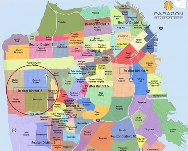
With the search for affordable homes, and houses in particular, becoming ever more challenging (or desperate), the greatest pressure of buyer demand moved to a large, lopsided curve of historically less expensive neighborhoods running along the western-most edge of the city from Outer Richmond south to Lake Merced, then east across the southern border with Daly City, and up through Bernal Heights and Bayview. Of these, we believe Realtor District 2, Sunset/Parkside, with its quiet streets and low crime rates; its closeness to the beach, GG Park and highways south to Silicon Valley; and its attractive, modest-sized houses built mostly in the 1930’s and 1940’s, is now the hottest, most competitive market in San Francisco.


Paragon Real Estate Group

Paragon Real Estate Group
 

The Hottest Neighborhood Market in San Francisco
and Other Real Estate Analyses


October 2016 Paragon Market Report

————————————————————


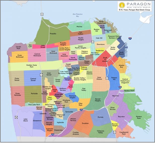
Link to our updated San Francisco neighborhood home-price map

Before jumping to neighborhood market dynamics and the hottest market in the city, here are a few overview analyses:


San Francisco Median Home Prices by Quarter
2012 – 2016


Median sales prices typically fall in Q3 from Q2 due to seasonal inventory and demand issues, and that occurred in 2016 as well. Year over year, the Q3 2016 house price is running above that of Q3 2015, while the condo median price has stayed essentially flat.

————————————————————

San Francisco Median Home Prices by Year
1993 – 2016

————————————————————

Biggest Surge in New Luxury Home Listings Ever


Even more so than the general market, the luxury home market is fiercely seasonal, with spring and autumn being much more active than summer and, especially, the mid-winter holiday doldrums. September is typically the single month with the highest number of new listings, which fuels the relatively short autumn selling season before the luxury market starts to go into hibernation in mid-late November. This year saw a particularly large jump in the number of new listings of homes of $2.5 million and above, to by far the highest level ever.

Because the time between listings coming on market, offers being negotiated and accepted, and then the transactions actually closing sale is 4 to 6 weeks or more, it will be a little while before we have hard data on how the market responded to this feast of expensive homes hitting the market.

The Hottest, Most Competitive Market in San Francisco

A Shift from Prestigious, Expensive, High-Tech and Hip
to Normal, Middle-Class, Working-People Affordable


Since the market recovery began in 2012, various districts have taken the lead as the hottest markets in San Francisco: The affluent and prestigious Noe-Eureka-Cole Valleys district and Pacific Heights-Marina district led the recovery out of recession. Later South Beach/SoMa, Hayes Valley and, especially the Mission, went white hot as the high-tech boom surged (though, honestly, high appreciation rates became general throughout the city). In mid-2015, price appreciation in many of the more expensive and fashionable districts started to slow down and plateau.

With the search for affordable homes, and houses in particular, becoming ever more challenging (or desperate), the greatest pressure of buyer demand moved to a large, lopsided curve of historically less expensive neighborhoods running along the western-most edge of the city from Outer Richmond south to Lake Merced, then east across the southern border with Daly City, and up through Bernal Heights and Bayview. Of these, we believe Realtor District 2, Sunset/Parkside, with its quiet streets; its closeness to the beach, GG Park and highways south to Silicon Valley; and its attractive, modest-sized houses built mostly in the decade before and decade after WWII, is now the hottest, most competitive market in San Francisco.


In the charts below, notice how year-over-year statistics have generally cooled somewhat in most areas of the city from the frenzied market prevailing in the first part of 2015: higher days on market, lower percentages of listings selling over asking price, higher months-supply-of-inventory figures, and so on. The most affordable districts are those generally showing the least, or even no, change year over year, and some of them are still sizzling. However, the 2016 statistics for SF house sales in no way suggest what would be described as a weak market in any of the city districts. (Some of the condo markets have softened more significantly.)


Overbidding Asking Prices: SF House Sales

Percentage of House Sales Selling over Asking Price

SF House-Price Appreciation Rates

Average Days on Market

Months Supply of Inventory:
Buyer Demand vs. Supply of Listings for Sale

————————————————————

San Francisco District Condo Markets


For a number of reasons, including a significant increase in new-construction projects, the condo market in San Francisco is not as strong as its house market, but without any hint of an impending crash: The median SF condo price has simply plateaued after years of feverish appreciation. Based upon our analyses of underlying market dynamics shown via the charts below, we believe the condo markets of the Noe, Eureka and Cole Valleys district, and the Richmond/Lake Street district are currently the most dynamic in the city. It is probably no coincidence that these areas are seeing comparatively little new condo construction adding to inventory.

The cooling of the condo market is clearly reflected in the 2016 vs. 2015 statistics. The first chart also illustrates, as mentioned in earlier reports, how the luxury condo segment ($2m+), especially in District 9 (greater SoMa/South Beach/ Yerba Buena) where the majority of new, luxury condo construction is occurring, has softened the most. These charts do not include the many hundreds of newly built or under construction condos listed, accepting offers or sold, which are not reported to MLS, as exact data on that activity is hard to verify.


Chart: Overbidding Condo Prices

Chart: Condo % Sales over List Price

Chart: Condo Average Days on Market


————————————————————

District Sales Overview
Sales Volumes and Sales Prices


Chart: Average San Francisco House Sizes by Neighborhood

As illustrated above, the 3 most affordable districts for buying a house in San Francisco are also 3 of the 4 districts with the most house sales.


25 years ago, the greater South Beach/ SoMa/ Mission-Bay area did not even have an appreciable amount of residential housing. Now, if we add new-condo sales not reported to MLS (which are not reflected in the chart above), it is the area with the greatest number of condo sales in the city, more than twice as many as the second ranking district. It is also now the foremost area for luxury condo sales, having leapt ahead of the old-prestige Pacific Heights and Russian Hill districts. This is the only place in the city where high-rise construction is currently allowed, and there is much new construction in the works.


————————————————————

New Bay Area Hiring Surge?
Employed Resident Count in 4 Central Bay Area Counties


Hiring and the population growth it engenders play a huge role in buyer and renter demand. After peaking in December 2015, the number of employed residents in the 4 middle Bay Area counties fell by 6000 through June 2016, the largest sustained drop in 5½ years. This seemed to correlate with an apparent cooling in the high-tech boom. Then in July & August 2016, a sudden, new hiring surge added almost 38,000 to the employment numbers, hitting a dramatic new high. We will have to wait for the data of future months to see if this is part of a sustained second wind in Bay Area hiring (especially in high-tech), or simply an unusually large, short-term fluctuation.

————————————————————


These analyses were made in good faith with data from sources deemed reliable, but may contain errors and are subject to revision. It is not our intent to convince you of a particular position, but to attempt to provide straightforward data and analysis, so you can make your own informed decisions. Median and average statistics are enormous generalities: There are hundreds of different markets in the Bay Area, each with its own unique dynamics. Median prices can be and often are affected by other factors besides changes in fair market value, and longer term trends are much more meaningful than short-term. It is impossible to know how median prices apply to any particular home without a specific comparative market analysis.

© 2016 Paragon Real Estate Group
No one knows San Francisco real estate better than Paragon.
Paragon Real Estate Group
www.paragon-re.com/

Pota Perimenis
Lic# 01117624
1400 Van Ness Avenue
San Francisco, CA 94109
Direct 415-738-7075
Cell 415-407-2595
pperimenis@paragon-re.com
www.sfcityhomes.com


Free home warranty with every transaction

Free Home Warranty with every Transaction

I am pleased to offer a free home warranty to every buyer or seller that I work with. I recently got an email from a client who used her home warranty to get several repairs worth thousands of dollars in her home. She wrote me an email to let me know how useful the home warranty was for her and to remind me to remind my clients to use theirs! I love knowing I add value in a variety of ways to my clients, making their lives a little easier and saving them money in the process. For all my buyers and sellers–your home warranty is there in case you need it. I hope you don’t need to, but if you do, don’t forget to use it!

San Francisco Home Sales by Price Segment

San Francisco Home Sales by Price Segment

San Francisco Home Sales by Price Segment

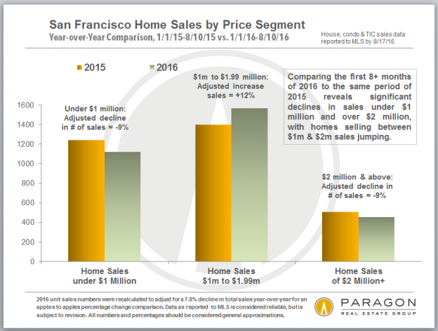
In thinking about the market, it seems that lower-priced home sales (especially houses) were still quite hot and sales under $1 million were clearly decreasing in volume as prices rose in more affordable areas. And sales of higher priced homes were decreasing as that segment cooled off, which would suggest that sales between $1m and $2m would be increasing, i.e. sales volume was increasingly being concentrated in the middle of the market.

It appears that median prices have generally been plateauing, but that disguises other changes and varying conditions in the market.

When adjusting 2016 numbers to compensate for a year-over-year decline in unit sales of 7.8%. After doing so, one sees unit sales below $1m and above $2m both dropped by about 9%, while sales of homes in between jumped 12%.

bay area median house appreciation

Bay Area Real Estate and Demographics

What Bay Area markets had the biggest bubble or crash?
Where are homes selling fastest for the most over asking price?
What county sells the most homes over $2 million?
Is most affordable? Most educated? Has the most Republicans?
Why do San Francisco, Oakland & Berkeley have rent control?

A San Francisco Bay Area Survey
including 20 custom charts and tables
August 2016

While waiting for the autumn market to begin, we thought we would step back and look at the Bay Area from a variety of angles. If you are tired of reading about real estate, there are some interesting demographic analyses at the bottom of this report.


Paragon Real Estate Group
 

Paragon Real Estate Group

What Bay Area markets had the biggest bubble or crash?
Where are homes selling fastest for the most over asking price?
What county sells the most homes over $2 million?
Is most affordable? Most educated? Has the most Republicans?
Why do San Francisco, Oakland & Berkeley have rent control?

A San Francisco Bay Area Survey
including 20 custom charts and tables
August 2016

While waiting for the autumn market to begin, we thought we would step back and look at the Bay Area from a variety of angles. If you are tired of reading about real estate, there are some interesting demographic analyses at the bottom of this report.


Ups & Downs in Bay Area Real Estate Markets


All Bay Area markets saw large surges in home values from 2000 to 2007; all went through significant or even terrible declines after the 2008 financial markets crash, typically hitting bottom in 2011; and all have made dramatic recoveries since. But there are big differences in how these events played out in distinct markets, with 4 main factors behind price changes over the past 16 years:

  • BUBBLE: Generally speaking, the lower price ranges and the less affluent areas saw much bigger, crazier bubbles than other segments, inflated in the years prior to 2007 by predatory lending, subprime loans and the utter abandonment of underwriting standards.
  • CRASH: In 2008-2011 distressed-property sales devastated the lower price segments, which suffered the biggest declines in home prices. When the recovery started in 2012, they began from unnaturally low points, which had little to do with fair market values. Other market segments were affected but to much lesser degrees.
  • PROXIMITY to the high-tech boom: SF and Silicon Valley have been the white-hot hearts of economic expansion. Oakland and the rest of Alameda County were the closest, significantly-more-affordable housing options. Then, as one moves further away, the electrifying effect on home prices gradually lessened.
  • AFFORDABILITY: The more affluent areas led the recovery in 2012-2014, but then the highest pressure of demand started shifting to less expensive, comparatively more outlying neighborhoods, cities and counties. Buyers desperately searched for affordable housing options, or simply wanted more home for the dollar. Now, some of the most expensive markets are beginning to cool, while less expensive ones remain very competitive.
  • A fifth factor just beginning to impact some markets now (such as the SF condo market) is the significant increase in new home construction, most of which is on the more, or much more, expensive end.


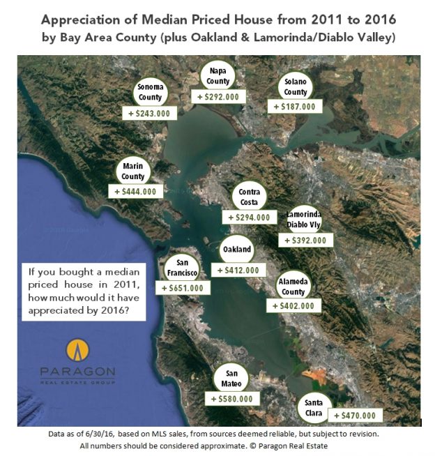
    The chart above illustrates median sales price changes, from 2007, the approximate peak of the bubble, to 2011, the approximate bottom after the crash, to the present, after 4-plus years of recovery. The table below summarizes the percentage changes charted above.


    OAKLAND had a very large subprime bubble, a huge crash, and then a sensational recovery highly pressurized by being just across the bridge from SF (and much more affordable). The Oakland median house price is up a staggering 178% since 2011, partly because it crashed so low. However, because its subprime bubble was so big, it is only 10% above its inflated 2007 price. Alameda County as a whole has experienced much the same market. Other comparatively lower-priced Bay Area markets, such as northern Contra Costa, Solano, Napa and Sonoma, more distant from the high-tech boom, saw similar dynamics, but are still below their 2007 peaks despite substantial recoveries.

    Price-change percentages up and down are not created equal: If a price drops 60%, it then has to go up 150% to get back to where it started.

    SAN FRANCISCO, more expensive and affluent, had a much smaller bubble and much smaller crash with far fewer distressed sales (and those mostly concentrated in its least expensive districts). The high-tech boom then supercharged its recovery: Its median house price is up 93% from the bottom hit in 2011 (much less than Oakland), but is 51% higher than its 2007 peak, the biggest increase over the 10 years of any of the markets measured. Silicon Valley has similar statistics, and other high-price markets like Marin and the Lamorinda/Diablo Valley area of Contra Costa County, saw comparable, if somewhat less dramatic, dynamics.

    These county market descriptions are gross generalizations, as each county has both very affluent and less affluent communities, with their own unique dynamics.

    Additional chart: Bay Area home price trends since 1990

    Additional chart: Bay Area dollar per square foot values

    Additional chart: Average Bay Area house sizes


    ------------------------------------------------------------

    Trends in Home Values since 1988
    per the S&P Case-Shiller Home Price Index


    Instead of looking at different locations in the Bay Area, Case-Shiller analyzes its entire market by low, mid and high-price tiers, each tier equaling one third of sales. For any Bay Area home, whatever its price in January 2000, Case-Shiller assigns it a value of 100. All other values on the chart below refer to percentages above or below the January 2000 price, i.e. 150 equals 50% price appreciation since that date. Case-Shiller does not use median sales price data, but instead uses its own custom algorithm to reach its conclusions.


    Two things stand out: As mentioned before, different price segments had bubbles, crashes and recoveries of vastly different magnitudes. Secondly, all the price tiers are now roughly the same percentage above their January 2000 prices, each showing about 130% appreciation over the past 16 years.

    Note how much higher the peak of the bubble in 2006-2007 was for the low-price tier of homes (light blue line): Prices jumped an incredible 170% from 2000 vs. 119% for the mid-price tier and 84% for the high-price tier. Then came a correspondingly gigantic crash.

    Our full report: 30+ Years of San Francisco real estate cycles


    ------------------------------------------------------------

    San Francisco Home Prices by Neighborhood,
    Property Type and Bedroom Count


    Below is one of 7 tables in our updated breakdown of SF home prices. The full report:
    SF Home Values Analysis by Neighborhood


    ------------------------------------------------------------

    Selected Bay Area Market Dynamics


    A selection of relatively self-explanatory snapshots measuring Bay Area real estate markets.


    San Francisco dominates the news, but it is a relatively small
    real estate market by number of sales.

    Virtually no place else in the country has seen competitive
    overbidding comparable to the inner core of the Bay Area.
    (Though some of it is caused by strategic underpricing.)


    Additional chart: Average days on market by county

    Additional chart: Median condo sales prices by county

    Additional chart: Comparative Bay Area rents

    Additional chart: Housing affordability in the Bay Area


    ------------------------------------------------------------

    Selected Demographic Snapshots


    A few angles on how the Bay Area is different from other places, and how Bay Area counties differ from one another.


    All Bay Area counties have been growing in population. San Francisco
    in particular is very densely populated and getting denser.

    In the spirit of the times, a look at Bay Area political party demographics.

    Along with Washington DC and Seattle, the Bay Area ranks among
    the best educated metro areas in the country.

    The single biggest factor behind strong rent control laws:

    ------------------------------------------------------------

    These analyses were made in good faith with data from sources deemed reliable, but may contain errors and are subject to revision. It is not our intent to convince you of a particular position, but to attempt to provide straightforward data and analysis, so you can make your own informed decisions. Median and average statistics are enormous generalities: There are hundreds of different markets in the Bay Area, each with its own unique dynamics. Median prices can be and often are affected by other factors besides changes in fair market value, and longer term trends are much more meaningful than short-term. It is impossible to know how median prices apply to any particular home without a specific comparative market analysis.


    © 2016 Paragon Real Estate Group
     
    No one knows Bay Area real estate better than Paragon.
    Paragon Real Estate Group
    www.paragon-re.com/

    Pota Perimenis
    Lic# 01117624
    1400 Van Ness Avenue
    San Francisco, CA 94109
    Direct 415-738-7075
    Cell 415-407-2595
    pperimenis@paragon-re.com
    www.sfcityhomes.com
     

    A Soft Landing after 4 Years of Market Frenzy?

    A Soft Landing after 4 Years of Market Frenzy?

    The San Francisco Real Estate Market Report
    including 15 custom charts, July 2016


    Paragon Real Estate Group

    Paragon Real Estate Group
     

    A Soft Landing after 4 Years of Market Frenzy?


    The San Francisco Real Estate Market Report
    including 15 custom charts, July 2016————————————————————


    San Francisco Median Sales Prices by Quarter 


    Since median sales prices fluctuate so much by season, the most useful metric is year over year, i.e. comparing Q2 2016 to Q2 2015. In Q2 2016, the year-over-year appreciation rate was 4% for houses and less than 1% for condos, as compared with 2014 to 2015 rates of 20% and 18%.


    Link to long-term median home price chart


    ————————————————————
    Transition
    By virtually every measurement of supply and demand, the SF real estate market cooled in Q2 2016 when compared to the 4 previous, often wildly overheated spring selling seasons. Listing inventory is up significantly, while the number of sales is down; the number of listings that expired without selling jumped by over 50%; and, as seen above, median sales prices for houses and condos increased year over year, but at much smaller percentages than the torrid rates of previous years. On the other hand, to keep perspective, the months supply of inventory is still under 3 months of inventory, which typically denotes a seller-advantage market in the rest of the country; the median days on market was a relatively low 24 days in Q2; and almost 70% of SF home sales went for over the asking price. Many homes are still selling quickly for very high prices.

    Within the city, different market segments are experiencing varying realities. Very generally speaking, the market for more affordable homes is stronger than that for luxury homes; the market for houses stronger than that for condos; and the market for luxury condos cooling most distinctly. Districts with the most new construction, i.e. adding more supply, are usually softening more quickly. It also appears that the city is cooling before other, more affordable Bay Area County markets. San Francisco led the way out of the market recession as the recovery began in 2012 and now may be leading the way in the transition to a less frenzied market. It is also true that transitional markets often send mixed signals in their data.

    In any case, it is typical for the market to slow down appreciably during the mid-summer months and then pick up again after Labor Day. Which does not necessarily mean it is not a good time to either buy or sell. For buyers in particular, there is usually greatly reduced competition for listings and thus greater scope to negotiate purchase prices.


    ————————————————————
    Average Sales Price to Original List Price Percentage
    Trends in Overbidding


    As the market has cooled, competitive bidding has declined, thus this past June saw an average sales price 3% over original asking price as compared to the crazy 11% seen in June 2015, when it hit an all-time peak.

    Link to our updated report on market seasonality


    ————————————————————
    Appreciation Trends, 2011 to 2016 YTD, by Neighborhood
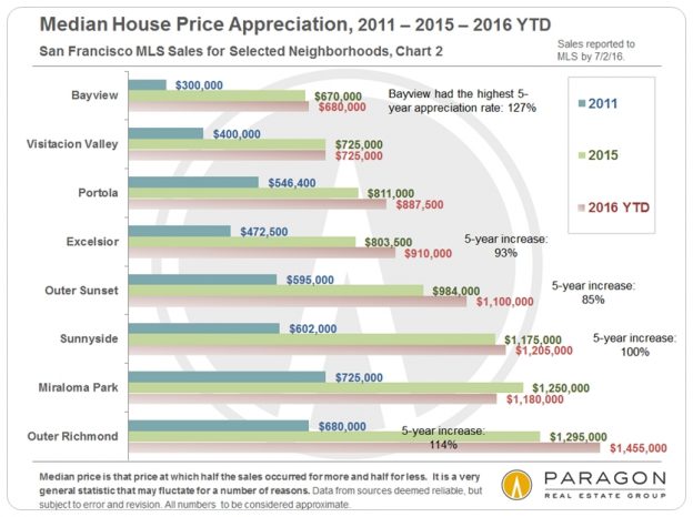
    These four charts below track median sales price appreciation from 2011 to 2015, generally the period of rapid increases, and then from 2015 to the first half of 2016, when prices started to stabilize for most areas. Areas that were hit hardest by the distressed property crisis, such as Bayview, often have the highest appreciation rates because they were bouncing back from unnatural lows in 2011. Median condo price appreciation is iffier as a measurement of change because the surge of new construction condos, which are typically more expensive than older units, have substantially impacted values in some neighborhoods. (House inventory in SF has barely changed in many decades, so year-over-year sales are closer to apples to apples.) There are also neighborhoods that have gone through both substantial gentrification and lots of new construction in recent years, such as the Mission and Hayes Valley.


    Houses

    Condos


    Generally speaking, neighborhoods were chosen because they had higher numbers of sales, which usually makes the statistics more reliable. However, median prices can sometimes fluctuate dramatically without great meaningfulness when different baskets of relatively unique homes simply closed in different periods. This is especially true in the most expensive districts: As an example, 20 house sales closed in Pacific Heights by 6/29/16 for a 2016 YTD median price of $5,675,000. Then, one more closed on 6/30/16 and the median price jumped to $6 million. A reminder not to take specific median price appreciation percentages too seriously: They illustrate general trends, not exact measurements of changes in home values.


    ————————————————————
    Context
    Anyone who reads real estate news, blogs or newsletters knows that there are 2 particularly vehement camps, each with emotional and sometimes financial attachments to diametrically opposed positions: One never stops insisting that the market is great and getting better (and apparently always will, for both buyers and sellers), and the other never stops shouting, usually gleefully, that the market is crashing or about to crash. Both marshal and exaggerate selected statistics and ignore others. The truth is that there are cycles, lulls and fluctuations in real estate markets and no market can go up 20% a year forever (nor should we want it to). On the other hand, we do not currently see local or macro-economic conditions suggesting any imminent crash. While it is true that economic, political or even environmental crises of various magnitudes can erupt suddenly (such as, in the past 12 months, the Chinese stock market plunge, the crash in oil prices, and Brexit), the impact of these crises can vary enormously, and it is very difficult to predict when the next one will hit.

    The SF market is clearly in some kind of transition, currently at a relatively moderate pace, hopefully signifying what is called a soft landing from an over-exuberant state. The speed and scale of any further adjustment should become clearer over the second half of the year.


    ————————————————————
    San Francisco Luxury Home Market

    A Breakdown of Expensive Home Sales by City District

    Luxury Home Sales Trends, by Quarter
    Luxury house sales were basically the same year-over-year in Q2 (though listing count was up almost 25%), however luxury condo sales saw a significant year-over-year drop, even while the number of expensive condo listings on MLS jumped to its highest level ever. The resale luxury condo market is clearly being impacted by an increase in new, luxury condo projects coming on market, especially in those areas where most of the new construction is occurring.

    Some of the new projects coming on line or expected soon will be the most expensive ever seen in San Francisco, estimating average dollar per square foot values for their units over, and sometimes well over, $2000. It will be interesting to see the match up of supply and demand for these condos, since such values in the existing resale market are relatively rare, as illustrated in the third chart below.


    Condo Sales by Average Dollar per Square Foot Values
    2012 to 2015 Trends, for Condo Sales Reported to MLS

    ————————————————————

    Home Sales Breakdown by District
    Underlying the median sales prices commonly quoted is commonly a huge range of prices in the specific home sales that go to make them up. We have updated our breakdowns for every district in San Francisco. Below are 2 of 15 charts which can be found here: SF District Sales by Price Segment.


    ————————————————————

    San Francisco Residential Construction Pipeline
    Projects of 60+ Units, per San Francisco Business Times Analysis


    The San Francisco Business Times performed a superb in-depth analysis of the many housing projects, rental and sale, market rate and affordable, currently in the Planning Department new construction pipeline, breaking out and describing major projects of 60 units or more, and mapping them as well. Above is our attempt to boil down much of that information into one chart. Please note that projects are constantly being added, revised, sold to new developers, or even abandoned, and the median time from filing a plan to building completion is 3 to 6 years depending on the size of the project. Our full report is here: SF Housing Inventory and Pipeline Report.

    Hundreds of condos under construction have already been pre-sold to buyers, with close of escrow and occupancy to occur upon final building completion, sometimes well in the future. These sales of units not yet built still have a significant impact on market supply and demand dynamics.

    It is also interesting to note that of projects either under construction or approved by Planning (and leaving aside the long-term mega-projects such as Treasure Island), rental units outnumber sale units by about 2 to 1. This is a very recent development in SF housing construction, which has long been dominated by condo projects (though there are plenty of those too). This expected rush of new rentals, most of which are at the high end of rental cost, is coming just as the rental market is dramatically softening in the city. Indeed, the rental market appears to have cooled much more quickly than the sale market.


    These analyses were made in good faith with data from sources deemed reliable, but may contain errors and are subject to revision. It is not our intent to convince you of a particular position, but to attempt to provide straightforward data and analysis, so you can make your own informed decisions. Statistics are generalities, longer term trends are much more meaningful than short-term, and we will always know more about what is actually going on in the present in the future. New construction condos not listed or sold on MLS are not counted in these statistics, though they often affect market dynamics. It is impossible to know how median prices apply to any particular home without a specific comparative market analysis.

    © 2016 Paragon Real Estate Group
    No one knows San Francisco real estate better than Paragon.
    Paragon Real Estate Group
    www.paragon-re.com/

    Pota Perimenis
    Lic# 01117624
    1400 Van Ness Avenue
    San Francisco, CA 94109
    Direct 415-738-7075
    Cell 415-407-2595
    pperimenis@paragon-re.com
    www.sfcityhomes.com


    Are you curious what your home is worth in this HOT market?

    To find out, Click here  or click on the image below for your free market report.

    This new online tool provides a comprehensive report on exactly what is selling in your
    neighborhood, free! There is no cost or obligation.

    Facebook_CMA_ad

    The San Francisco Luxury Home Market

    The San Francisco Luxury Home Market

    Homes of $2 Million & Above

    Auto-Updating Market Analytics

    The bar charts compare year-over-year data, going back 2 years, for the latest month. The line charts track monthly data over a period of 3 to 5 years. Note that it can take 7 to 15 days after a month’s end for agents to enter in transaction data pertinent to the month in question, so statistics for the latest month can sometimes change significantly as this data is added to calculations.


    FaceBook FaceBook FaceBook FaceBook FaceBook FaceBook

    The San Francisco Luxury Home Market

    Homes of $2 Million & Above

    Auto-Updating Market Analytics

    The bar charts compare year-over-year data for the latest month. The line charts track monthly data over a period of 3 to 5 years. Note that it can take 7 to 15 days after a month’s end for agents to enter in transaction data pertinent to the month in question, so statistics can change as this data is added to calculations.

    Seasonality plays a significant role in luxury real estate statistics as the market ebbs and flows during active and less active sales seasons. Typically, the market is most active in the spring and fall, and much slower in the summer and, especially, the mid-winter holidays.


    Moving your cursor over the line charts will reveal monthly data.

    New Listings Coming on Market, by Month

    September is usually the single biggest month for new high-end home listings.
    Spring is typically the most active season for new listings.
    New listing activity plunges during the mid-summer and mid-winter holidays.

    Total Number of Active Listings for Sale during Month

    Number of Listings Accepting Offers, by Month

    Number of Sales, by Month

    Percentage of Listings Selling for over Asking Price, by Month

    Median Percentage of List Price Achieved on Sale

    Over 100% usually signifies competitive overbidding;
    under 100% signifies more aggressive buyer negotiation.

    Median Dollar per Square Foot (upon Sale)
    3-Month Rolling Average

    Months Supply of Inventory (MSI), by Month

    The lower the MSI, the greater the buyer demand as compared
    to the inventory of listings available to buy.

    Median Days on Market before Acceptance of Offer
    3-Month Rolling Average

    Expensive Home Sales by San Francisco District & Neighborhood

    Note that these charts using differing price points for the “luxury home” designation.

    Other reports you might find interesting:

    Market Analytics for General SF Market

    30+ Years of San Francisco Real Estate Cycles

    San Francisco Neighborhood Affordability

    10 Big Factors behind the San Francisco Real Estate Market

    Bay Area Apartment Building Market

    Link to San Francisco Neighborhood Map

    It is the relationship between supply and demand that defines the state of the market. Looking at one statistic such as the number of sales, without comparing it to how many listings were available to purchase, may give a distorted view of market conditions. Some statistics, such as months supply of inventory take both supply and demand into account. Last but not least, short-term statistics sometimes fluctuate without great meaningfulness - longer-term trends are always most meaningful.

    Sales data usually reflects market activity, i.e. when a new listing comes on market and offers are negotiated, occurring 4 to 8 weeks before the sale date. Thus, for example, sales in June mostly reflect new listings and offers negotiated in late April and May.

    These charts were generated using the Infosparks system by Paragon’s chief market analyst. The statistics only reflect activity reported to MLS, and many new-project-condo sales are not reported. Data is from sources deemed reliable but may contain errors and subject to revision.

    San Francisco House & Condo Markets Diverge

    San Francisco House & Condo Markets Diverge

    Non-Luxury House Market Remains White Hot
    Supply & Demand Balance Shifts in Condo Market
    Luxury Condo Market Continues to Cool

    April 2016 report, including 15 custom charts

    In the first quarter of 2016, various market segments in the city began to trend in significantly different directions. Houses, especially those below $2 million, are still often selling in a frenzy of bidding: Recent reports of houses selling with 5, 10 or more competing offers are not uncommon, especially in neighborhoods considered more affordable (by San Francisco standards). Demand remains very high, supply remains extremely low, and new house construction is virtually nil.


    Paragon Real Estate Group
     

    Paragon Real Estate Group

    San Francisco House & Condo Markets Diverge

    Non-Luxury House Market Remains White Hot
    Supply & Demand Balance Shifts in Condo Market
    Luxury Condo Market Continues to Cool

    April 2016 report, including 15 custom charts

    In the first quarter of 2016, various market segments in the city began to trend in significantly different directions. Houses, especially those below $2 million, are still often selling in a frenzy of bidding: Recent reports of houses selling with 5, 10 or more competing offers are not uncommon, especially in neighborhoods considered more affordable (by San Francisco standards). Demand remains very high, supply remains extremely low, and new house construction is virtually nil.

    However, thousands of new-construction condos have hit the market in recent years or are arriving shortly, with many thousands more in the 5-year pipeline. In recent years, the new supply added to the usual resale-condo inventory still did not keep up with demand, but that seems to be shifting, especially at the more expensive end of the condo market. As of early April, the number of condo listings actively for sale in MLS is up over 40% year over year, and that does not include most of the new-construction condo units hitting the market (not listed in MLS).

    This does not mean that condos are not selling, because many are at top prices. But the demand-per-listing ratio is declining, multiple offers are less common, and more listings are expiring without being sold. This particularly appears to be the case in those neighborhoods where most of the new construction projects are concentrated, and, again, the luxury-condo segment appears to be most affected. Apparently, the developer rush to build large projects of very expensive condos, possibly outpacing long-term demand for such units, is also playing out in Manhattan (where admittedly luxury condos are much more expensive).

    It is unclear at this point whether new condo projects themselves are being affected in their rate of sales or sales prices. These condos often go into contract during the construction phase, long before sales actually close, and access to information during that period is very limited. There can be no doubt that they comprise serious competition to resale condos in the areas they’re being built.

    Please note: The data of one quarter is not definitive and Q1 was a very volatile period for the financial markets, which may have had a short-term effect that might now shift. SF is also a city of micro-markets, so what applies in one district may not apply in another. Q2, just beginning, is typically the busiest of the year, and market trends will become much clearer in coming months. Last but not least, in real estate, what we see today generally reflects the market 4 to 8 weeks ago due to the gap between listings coming on market, offers being negotiated, and sales finally closing escrow.

    ————————————————————

    Market Supply & Demand Trends
    by Property Type and Price Segment


    It should be noted that some of the Q1 2016 MLS statistics shown below, which appear to illustrate a cooling of certain market segments in San Francisco, would in most other areas of the country often be considered signs of crazy-hot markets.


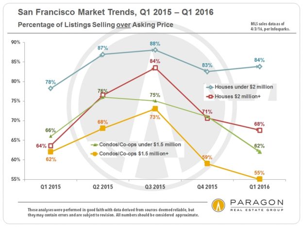
    An astonishing 84% of Q1 2016 SF house sales under $2 million sold for over asking price, a very small decline from the most active quarters of last year. The percentage for more expensive houses is 16 percentage points lower than less expensive houses, but still above Q1 2015. Condos, also shown in two price segments, have lower percentages than any time in the past 4 quarters. We shall see if those percentages rebound in Q2, as usually occurs once the spring season warms up, or whether increased inventory dampens overbidding going forward.


    The same trends seen in the first chart above apply to this illustration of the median percentage of sales price over list price over the past 5 quarters. For houses under $2 million, the median percentage over asking price remains incredibly high at 12%, a clear sign of feverish competition between buyers. In contrast, luxury condos overall sold just a tiny bit above list price (less than one half of one percent), and in those districts seeing the most high-rise, luxury condo construction, the median sales price to list price percentage fell well below list price (not shown on chart). More supply means less competition and less sense of urgency in buyers; overbidding becomes rarer and buyers negotiate more aggressively.


    Perhaps nothing is more indicative of a cooling market than increasing numbers of listings expiring and being withdrawn from the market without selling. Q1 2016 saw big jumps in expired/withdrawn condo listings over the first quarters of the previous 3 years. Many such listings end up coming back on the market at lower prices.


    Again, houses under $2 million have maintained a very high level of listings going into contract on a monthly basis. High percentages of this statistic keep inventory low even when increased inventory starts coming on market, analogous to putting food in front of a very fast, hungry eater. However, if a low percentage of listings accepting offers is coupled with increasing numbers of new listings, inventory starts mounting quickly, because more unsold listings from previous months get added on top of the additional new listings streaming onto the market. The slow-eating diner is outpaced by the delivery of new courses, and the table fills up with uneaten food.

    ————————————————————

    San Francisco Median Home Sales Prices
    House & Condo, by Quarter

    Chart: Median Price Trends since 1993


    So far, any market cooling that has occurred is not showing up in Q1 median sales prices: Median prices for both houses and condos remain close to the high points hit in spring 2015. However, for the first time in 4 years, condo median prices did not jump in the first quarter of the year, though neither was there any significant decline. 2012 to 2015, overheated spring selling seasons of very high demand and deeply inadequate supplies of homes for sale have fueled most of the home-price appreciation occurring each year in San Francisco. We shall soon know whether this trend will continue this spring, or whether the median prices of some market segments will finally plateau, or even adjust downward with changing supply and demand dynamics.

    ————————————————————

    Employment Statistics


    Perhaps nothing underpins an appreciating real estate market more than increasing numbers of people moving into an area to take new jobs, especially well paid ones. These charts illustrate the recent explosion of employment in San Francisco and the Bay Area. Of course, employment trends can slow or even reverse directions as occurred after the dotcom bubble burst. It is interesting to note that SF employment (and rents) fell much more after the dotcom adjustment than after the 2008 financial markets crash. On the other hand, SF home prices only temporarily dipped in 2002, while dropping rapidly in late 2008/early 2009 and then remaining depressed until the recovery began in 2012.

    Chart: SF High-Tech Employment Trends

    ————————————————————

    Stock Markets & Interest Rates


    After all the travail regarding the stock market volatility since last summer, it is now, as of early April, pretty much back to where it began. And interest rates have actually fallen since the Fed raised the benchmark rate in mid-December. These conditions are typically considered very positive for real estate markets, though both can be subject to sudden and significant change.


    Chart: Short-term Interest Rate Trends


    Other recent reports you might find interesting:

    San Francisco New-Housing Pipeline

    San Francisco Neighborhood Affordability

    Seasonality & Real Estate Markets

    Bay Area Housing Affordability

    S&P Case-Shiller Index for SF Metro Area

    These analyses were made in good faith with data from sources deemed reliable, but they may contain errors and are subject to revision. Statistics are generalities and all numbers should be considered approximate. New construction condos not listed or sold on MLS are not counted in these statistics, though they often affect market dynamics. Sales statistics of one month generally reflect offers negotiated 4 to 6 weeks earlier, thus a fair number of YTD 2016 sales reflect market activity in late 2015.


    © 2016 Paragon Real Estate Group
     
    No one knows San Francisco real estate better than Paragon.
    Paragon Real Estate Group
    www.paragon-re.com/

    Pota Perimenis
    Lic# 01117624
    1400 Van Ness Avenue
    San Francisco, CA 94109
    Direct 415-738-7075
    Cell 415-407-2595
    pperimenis@paragon-re.com
    www.sfcityhomes.com
     

    San Francisco Neighborhood Affordability

    San Francisco Neighborhood Affordability
    Where a buyer is most likely to find a home in the price segment they’re looking in, whether under $1 million or over $5 million.


    Where to Buy a Home in San Francisco
    for the Money You Want to Spend


    February 2016 Report on Neighborhood Home Prices

    A city neighborhood map is provided at the bottom of this analysis.

    The charts below are based upon San Francisco home sales reported to MLS in the 10 to 12 months through February 15, 2016, breaking out the neighborhoods with the most sales within given price points. Other neighborhoods not listed did have smaller numbers of sales within given price segments.


    Where to Buy a HOUSE for under $1 million

    The overall median HOUSE price in the city in the 4th quarter of 2015 was $1,250,000, so the under million-dollar house is becoming increasingly less common. The vast majority of house sales in this price segment now occur in a large swath of neighborhoods running across the southern border of the city, which are by far its most affordable house markets: from Bayview through Portola, Excelsior, Visitacion Valley and Crocker Amazon, to Oceanview and Ingleside.

    The chart’s horizontal columns reflect the number of sales of houses with at least 2 bedrooms, with parking, for under $1 million, while the median sales prices noted are for all 2BR house sales during the period. Median price provides a good idea of overall neighborhood house prices.


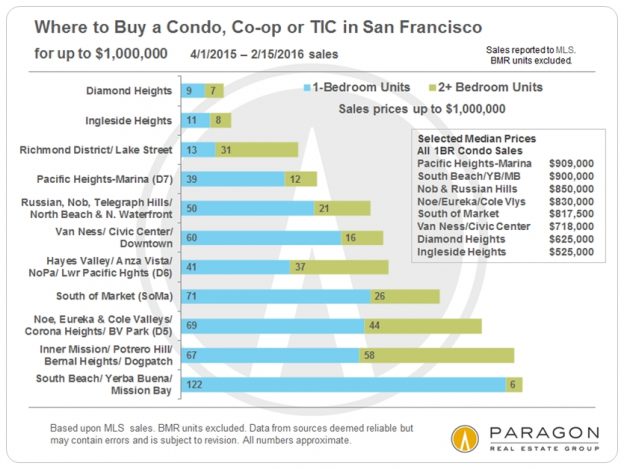
    Where to Buy a CONDO, CO-OP OR TIC for under $1 million

    The overall SF median condo price in the 4th quarter of 2015 was about $1,100,000, and sales under $1m still occur in almost every area of the city that features these property types – but a studio unit in Russian Hill may cost as much as a 2-bedroom condo in Diamond Heights.

    Of these property types, condos make up about 90% of sales, stock co-op apartments 1 to 2%, with TICs making up the balance. TICs typically sell at a significant discount (10% - 20%) to similar condos.

    The horizontal columns reflect the number of sales under $1m broken out by 1-bedroom and 2-bedroom units. The box of median sales prices is just for 1BR units, again simply to give an idea of relative values between neighborhoods.


    Spending $1 Million to $1.5 Million in San Francisco


    In this price point for houses, one starts moving into another layer of neighborhoods in the west and the central-south areas of the city: Central Sunset and Parkside, Miraloma Park, Sunnyside, Mission Terrace, Bernal Heights and others as shown. There has been a lot of upward pressure on these areas in the past 2 years in particular.

    The horizontal columns reflect the number of sales, with the average dollar per square foot values for the homes in this price range noted alongside.


    Condo and co-op sales in this price range are mostly concentrated in those areas where newer condo developments have surged onto market over the past 10 – 15 years, and continue to arrive in increasing numbers – South Beach, Inner Mission, Hayes Valley, Dogpatch, SoMa – as well as in high-end neighborhoods such as Pacific Heights, Russian Hill and the greater Noe-Eureka Valleys area.


    Buying a HOUSE for $1.5 million to $2 million

    Buying a HOUSE for $2 million to $2.5 million


    When you get to the $2 to 2.5 million dollars range, the house market becomes dominated by the greater Noe-Eureka-Cole Valleys district, the St. Francis Wood-Forest Hill district, the Potrero Hill-Inner Mission area, and the Inner-Central Richmond and Lake Street area.


    Buying a LUXURY HOME in San Francisco


    For the sake of this report, houses selling for $2.5 million and above, and condos, co-ops and TICs selling for $1.5 million and above are designated (somewhat arbitrarily) as luxury home sales. What you get in different neighborhoods for your millions of dollars will vary widely. Views often play a significant role in SF home values, but particularly in the luxury condo market, where the most expensive units often offer staggering views from very high floors. Over the past 15 years – and accelerating in the current market recovery – there have occurred some very large shifts in the luxury home market, with districts other than the old-prestige, northern neighborhoods becoming major destinations for (very) high-end homebuyers. However the northern neighborhoods like Pacific Heights still dominate the ultra-high end in SF: houses selling for $5 million or more. The greater South Beach-Yerba Buena area, with its many new luxury condo towers now has more luxury condo sales than any other area.


    Luxury CONDO, CO-OP & TIC Sales

    Luxury HOUSE Sales

    San Francisco Neighborhood Map


    For prevailing SF median house and condo prices, our interactive
    map of neighborhood values can be found here: SF Neighborhood
    Home-Price Map

    Other updated reports you might find interesting:

    Our Most Recent Market Analyses

    30+ Years of San Francisco Real Estate Cycles: This is by far the most popular article on our website – for 3 years running.

    San Francisco Market Overview Analytics: Interactive, auto-updating charts for all the standard real estate statistics – median sales price, average dollar per square foot, days on market, months supply of inventory, listings for sale, and so on.

    San Francisco District Sales Overview: A breakdown of sales by price segment for 14 different sections of the city.

    10 Big Factors behind the San Francisco Real Estate Market: A review of the major economic, political and demographic issues underlying the city’s current market.

    As always, the quality of the specific location and the range of amenities of the property; its curb appeal, condition, size and graciousness; and the existence and quality of parking, views and outside space can all significantly impact unit values.

    These analyses were made in good faith with data from sources deemed reliable, but they may contain errors and are subject to revision. Statistics are generalities and how they apply to any specific property is unknown without a tailored comparative market analysis. Sales statistics of one month generally reflect offers negotiated 4 – 6 weeks earlier. Median sales prices often change with even the smallest change in the period of time or parameters of the analysis. All numbers should be considered approximate.


    © 2016 Paragon Real Estate Group