


|
|||||||||||||||
|
|||||||||||||||


|
|||||||||||||||
|
|||||||||||||||
|
|||||||||||||||
|
|||||||||||||||
|


 Chart 2: San Francisco Condo Market Overview
 ————————————————————
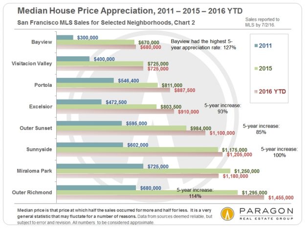
Annual Median House Sales Price Trends:
5 Selected San Francisco Neighborhoods, since 2004

Generally speaking, in higher priced areas, median house prices have been plateauing or dropping a little, while the more affordable neighborhoods have continued to appreciate: This is a relatively common dynamic around the Bay Area.
The only way to assess value or appreciation for a particular home is by performing a comparative market analysis tailored to its specific location, condition and circumstances. Of all the neighborhoods graphed above, the Marina has by far the fewest house sales and the widest range of individual home sales prices, so it is most susceptible to median price fluctuations caused by other factors besides changes in value – for example, a substantial change in the listings available to purchase in a given year. We do not believe that the same Marina house selling in 2015 would have sold for 15% less in 2016: something less, perhaps; 15% less, very unlikely. This is a good illustration of the dangers of making too much of median sales price changes.
If you would like median home price trends for another San Francisco neighborhood, please let us know.
Average Sales Price to Original List Price Percentage
By Month: House, Condo, Co-op, TIC & 2-4 Unit Building Sales
As seen in this chart, overbidding typically heats up as the market moves into spring. So far, this year has been no exception, though the overbidding percentages are somewhat lower than in recent years.

Annual Market Trends
For clarity and meaningfulness, we much prefer annual trend analyses, with their much bigger data sets, and have recently completed a comprehensive review of virtually every statistic we could think of on that basis. Doing so allows us to stand back to see the broader view of what is happening in the market, instead of getting obsessed by what happens to be in front of our shoe. Looking at annual trends, virtually all the market statistics illustrate the same general conclusion: The market became progressively stronger coming out of the 2009-2011 housing recession; the frenzy peaked in 2015; and the market cooled a bit in 2016, condos more so than houses. This is a generalization of the macro-trend: Different market segments have been going in somewhat different directions and speeds in the city and around the Bay Area in the past year or so.
Below are a few of the many analyses. The full review is here: Long-Term Annual Trends in San Francisco Real Estate
First 2 charts: The hotter the market, the greater the percentage of listings that sell quickly, and the more ferocious the competitive bidding on those listings.


San Francisco Luxury Home Market
Three sample charts from our big report on the high-priced home segment. Generally speaking, the luxury market has cooled more than the more affordable segments, and the luxury condo market has cooled more than the luxury house market. This is mostly due to the recent surge of new-construction luxury condos onto the market in the city.
The first two charts below are snapshots of either the house or condo segment of the luxury market in two of our major districts.


Interest Rates
Constantly shifting economic and political factors continue to affect rates: Mortgage interest rates are significantly up since the election, fluctuating up and down since the year began, but still far below historical norms. This is a factor everyone is watching carefully because of its potential impact on affordability, already a big issue in the Bay Area.

Apartment Building (Multi-Unit Residential) Sales
We have also released our quarterly report on the multi-unit residential property markets of San Francisco, Marin and Alameda Counties: Bay Area Apartment Building Market. Below is one of its many analyses.

Using, Understanding and Evaluating Real Estate Statistics
If you will forgive a little celebrating on our part: In the last two quarters, Paragon sold more San Francisco residential and multi-unit residential real estate than any other brokerage (as reported to MLS, per Broker Metrics), even though we have far fewer agents than many of our competitors.
If you have any questions or comments regarding this report, or if assistance can be provided in any other way, please call or email.
It is impossible to know how median and average value statistics apply to any particular home without a specific comparative market analysis, which we are happy to provide upon request.
These analyses were made in good faith with data from sources deemed reliable, but may contain errors and are subject to revision. It is not our intent to convince you of a particular position, but to attempt to provide straightforward data and analysis, so you can make your own informed decisions. Median and average statistics are enormous generalities: There are hundreds of different markets in San Francisco and the Bay Area, each with its own unique dynamics. Median prices and average dollar per square foot values can be and often are affected by other factors besides changes in fair market value. Longer term trends are much more meaningful than short-term.
No one knows San Francisco real estate better than Paragon.
| Paragon Real Estate Group www.paragon-re.com/ |
|

|
||||||||||||||
|
||||||||||||||
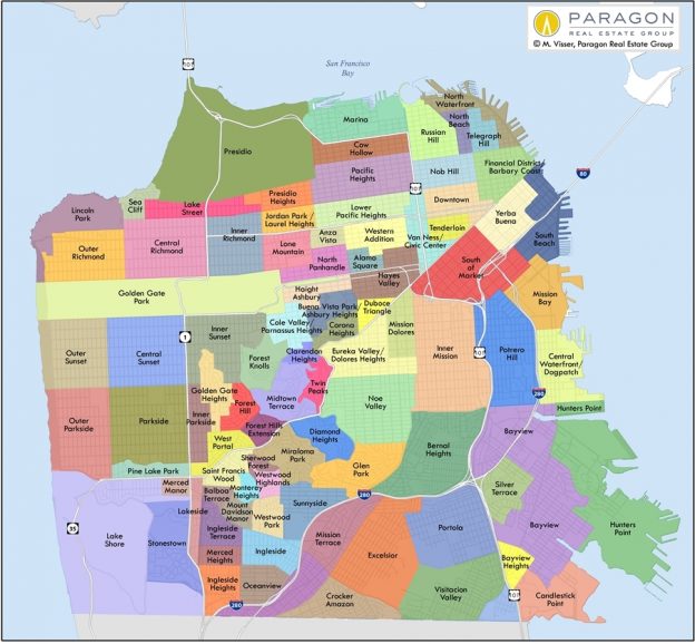
San Francisco Median Sales Prices
by Neighborhood, 2016 YTD
Reflecting house & condo sales
as reported to San Francisco MLS 1/1/16 – 9/15/16
* Move your mouse over map to select neighborhood icons *
A Shift from Prestigious, Expensive, High-Tech and Hip
to Normal, Middle-Class, Working-People Affordable
October 2016 Paragon Market Report
Since the market recovery began in 2012, various districts have taken the lead as the hottest markets in San Francisco: The affluent and prestigious Noe-Eureka-Cole Valleys district and Pacific Heights-Marina district led the recovery out of recession. Later South Beach/SoMa, Hayes Valley and, especially the Mission, went white hot as the high-tech boom surged (though, honestly, high appreciation rates became general throughout the city). In mid-2015, price appreciation in many the more expensive and fashionable districts started to slow down and plateau.
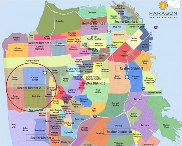
With the search for affordable homes, and houses in particular, becoming ever more challenging (or desperate), the greatest pressure of buyer demand moved to a large, lopsided curve of historically less expensive neighborhoods running along the western-most edge of the city from Outer Richmond south to Lake Merced, then east across the southern border with Daly City, and up through Bernal Heights and Bayview. Of these, we believe Realtor District 2, Sunset/Parkside, with its quiet streets and low crime rates; its closeness to the beach, GG Park and highways south to Silicon Valley; and its attractive, modest-sized houses built mostly in the 1930’s and 1940’s, is now the hottest, most competitive market in San Francisco.
|
||||||||||||||
|
||||||||||||||
What costs how much and where in San Francisco?
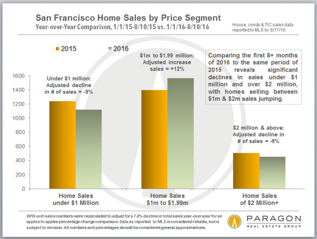
San Francisco Home Sales by Price Segment
In thinking about the market, it seems that lower-priced home sales (especially houses) were still quite hot and sales under $1 million were clearly decreasing in volume as prices rose in more affordable areas. And sales of higher priced homes were decreasing as that segment cooled off, which would suggest that sales between $1m and $2m would be increasing, i.e. sales volume was increasingly being concentrated in the middle of the market.
It appears that median prices have generally been plateauing, but that disguises other changes and varying conditions in the market.
When adjusting 2016 numbers to compensate for a year-over-year decline in unit sales of 7.8%. After doing so, one sees unit sales below $1m and above $2m both dropped by about 9%, while sales of homes in between jumped 12%.
What Bay Area markets had the biggest bubble or crash?
Where are homes selling fastest for the most over asking price?
What county sells the most homes over $2 million?
Is most affordable? Most educated? Has the most Republicans?
Why do San Francisco, Oakland & Berkeley have rent control?
A San Francisco Bay Area Survey
including 20 custom charts and tables
August 2016
While waiting for the autumn market to begin, we thought we would step back and look at the Bay Area from a variety of angles. If you are tired of reading about real estate, there are some interesting demographic analyses at the bottom of this report.
|
|||||||||||||||
|
|||||||||||||||
A Soft Landing after 4 Years of Market Frenzy?
The San Francisco Real Estate Market Report
including 15 custom charts, July 2016
|
||||||||||||||
|
||||||||||||||


Pota Perimenis is committed to providing an accessible website. If you have difficulty accessing content, have difficulty viewing a file on the website, or notice any accessibility problems, please contact us at (415) 407-2595 to specify the nature of the accessibility issue and any assistive technology you use. We strive to provide the content you need in the format you require.


