<
|
||||
|
Some Shifts in San Francisco Market
New Listings & Price Reductions
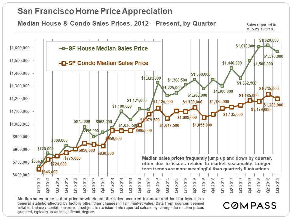
Jump in September Q3 2018 Median SF House Price
October 2018 Market Report
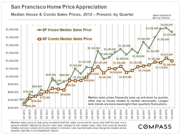
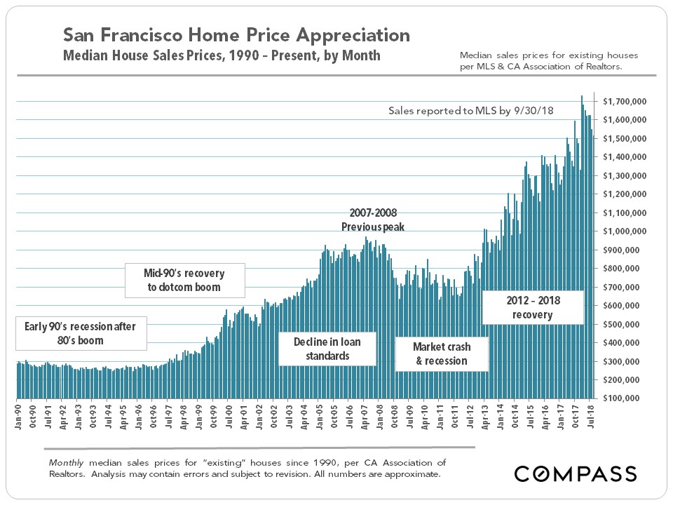
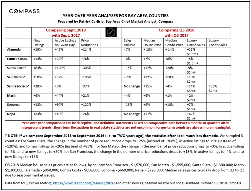
In July 2018, Paragon Real Estate merged with Compass. ———————————————————— Median SF Home Sales Prices Quarterly & Long-Term Trends Due mostly to seasonal issues, median sales prices typically drop in Q3 from Q2 peaks, and did so this year as well. The median SF house price was up 15% and the median condo price was up 4% from Q3 2017. The other Bay Area counties also saw substantial year-over-year increases in median home sales prices in Q3 2018.
———————————————————— New Listings & Price Reductions September is always a big month for new listings coming on market in San Francisco – typically with the highest number of the year – and this year they jumped 28% higher than in September 2017 to hit their highest point in years. 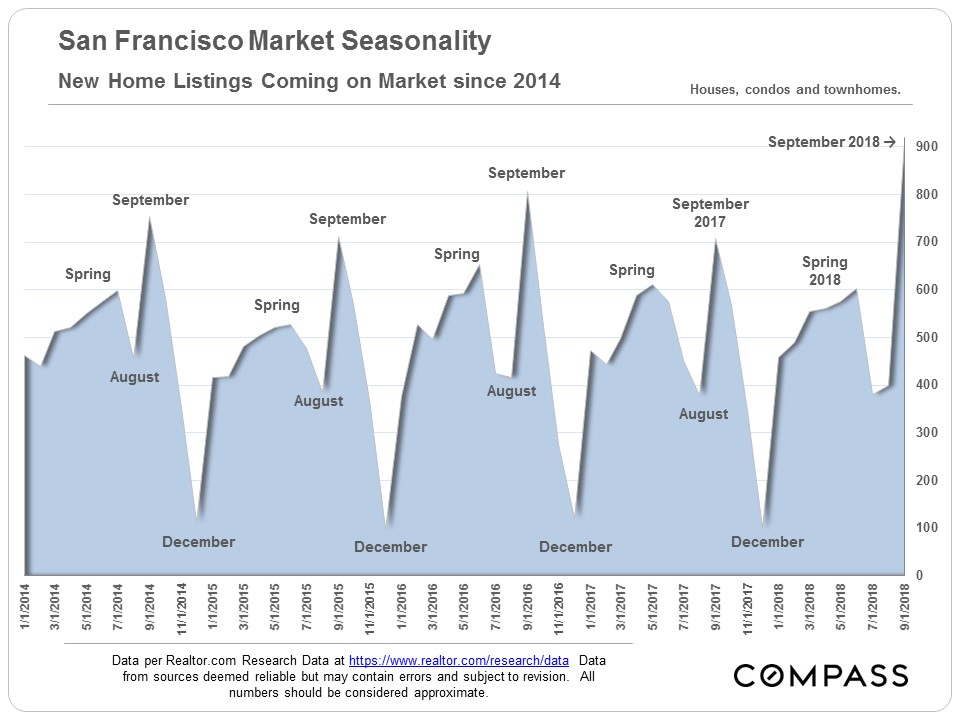
The number of price reductions in September also increased: 37% over 2017 and 18% over 2016. October is usually one of the two biggest months of the year for price reductions as sellers of unsold listings make a last attempt to grab the attention of buyers before the mid-winter slowdown begins in mid-November. 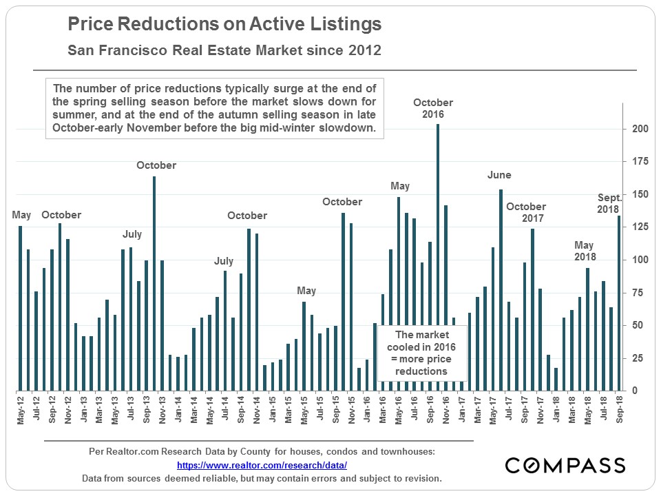
The number of active listings on the market on a given day in September was somewhat higher than last year, but a bit lower than in September 2016. 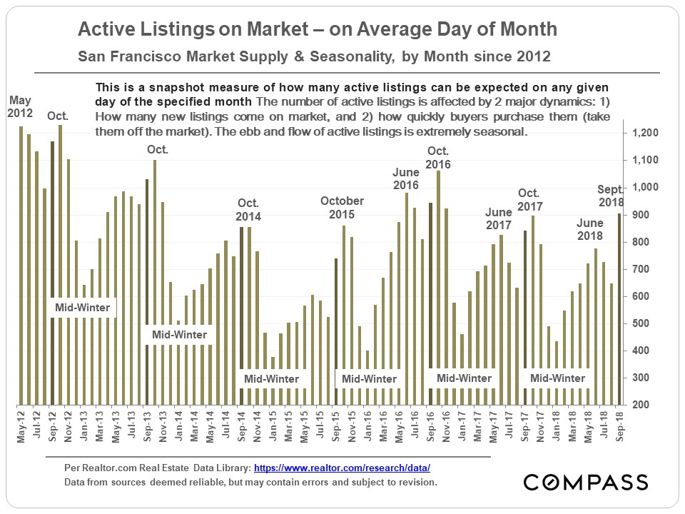
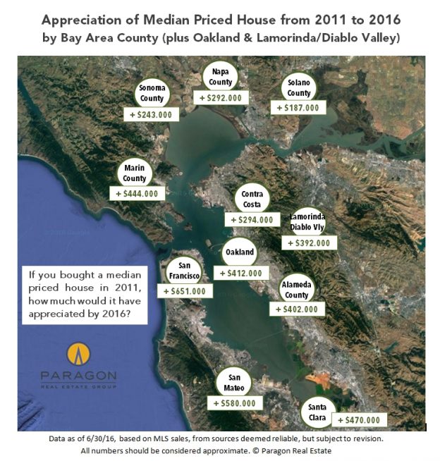
What will tell us most about where the market is heading is how buyers respond to these new listings and price reductions, and that information won’t be available until autumn’s listings have time to accept offers, and accepted offers have time to close escrow – in quantity – to give us their data. October is usually a very big month for sales in San Francisco as buyers jump on the surge of listings. ———————————————————— Bay Area Statistics by County Jumps in listings and price reductions have been common around the Bay Area, and in some counties, the changes are much more pronounced than in SF: Sonoma saw a 122% increase in price reductions amid an active inventory of listings 90% higher than in September of last year. Santa Clara County saw staggering increases, but much of that is due to the fact that inventory was incredibly, abnormally low last year, when Santa Clara was perhaps the hottest real estate market in the country.
————————————————————
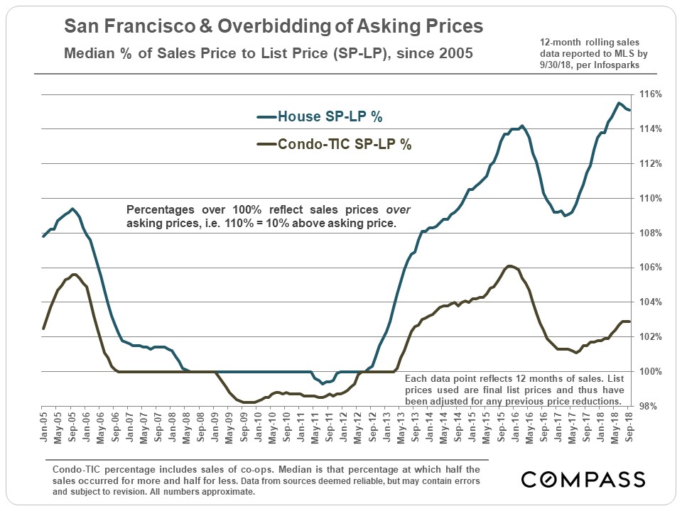
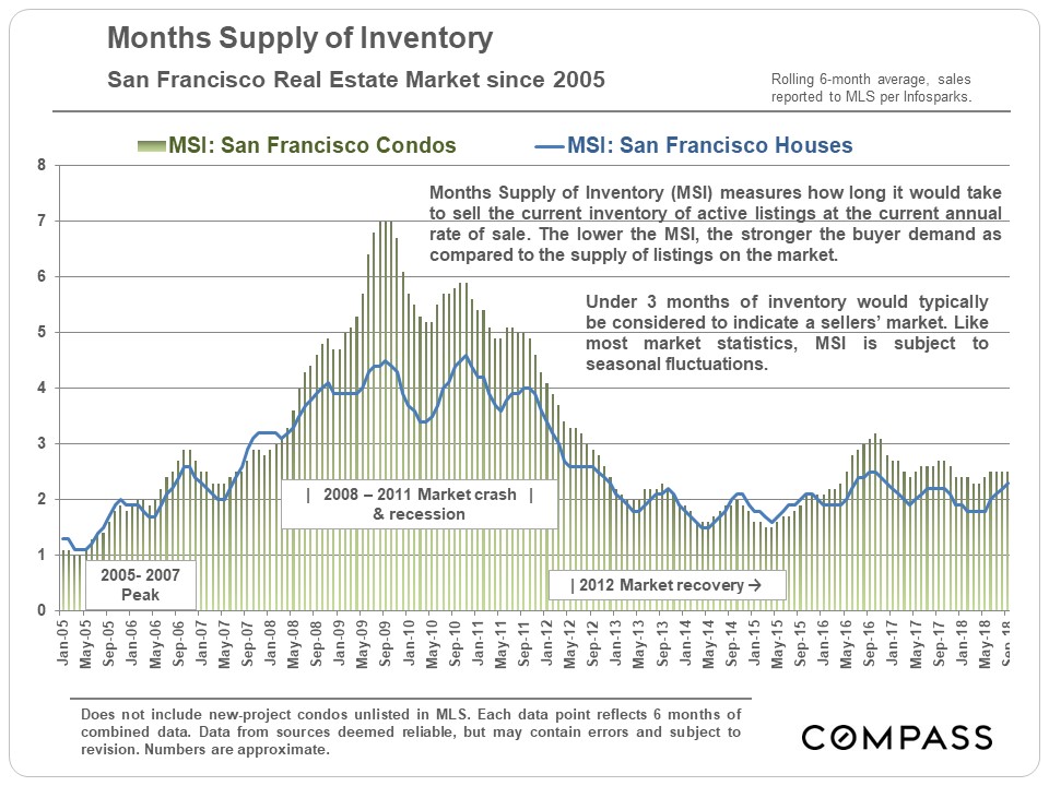
Days on Market, Overbidding & So far, we are not seeing significant shifts in these 3 standard measurements of market heat.
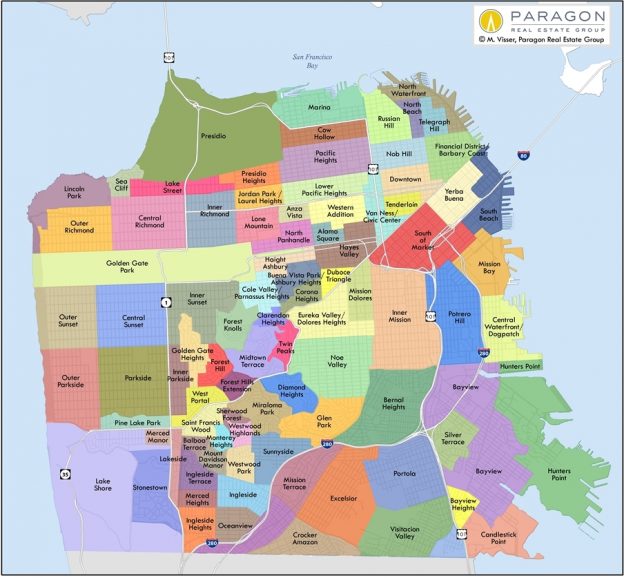
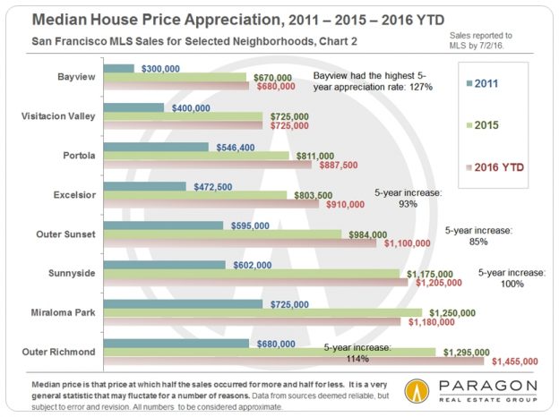
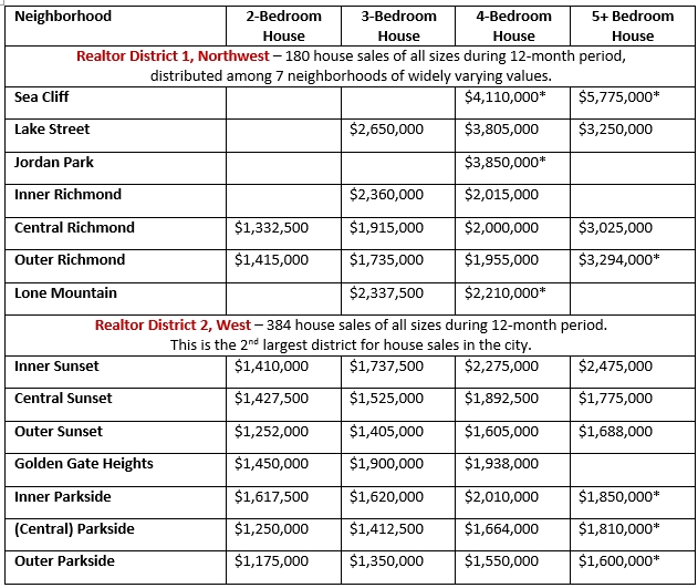
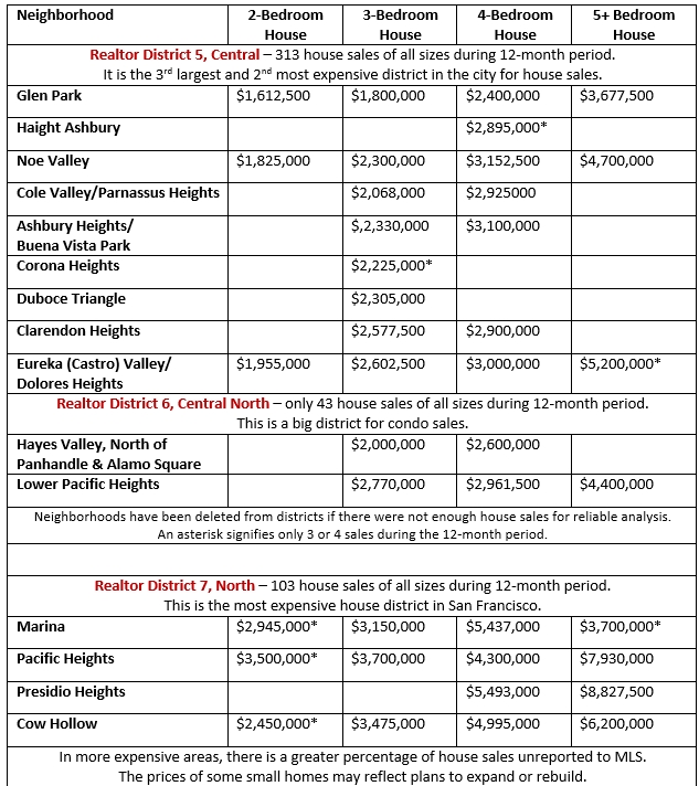
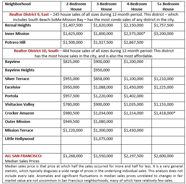
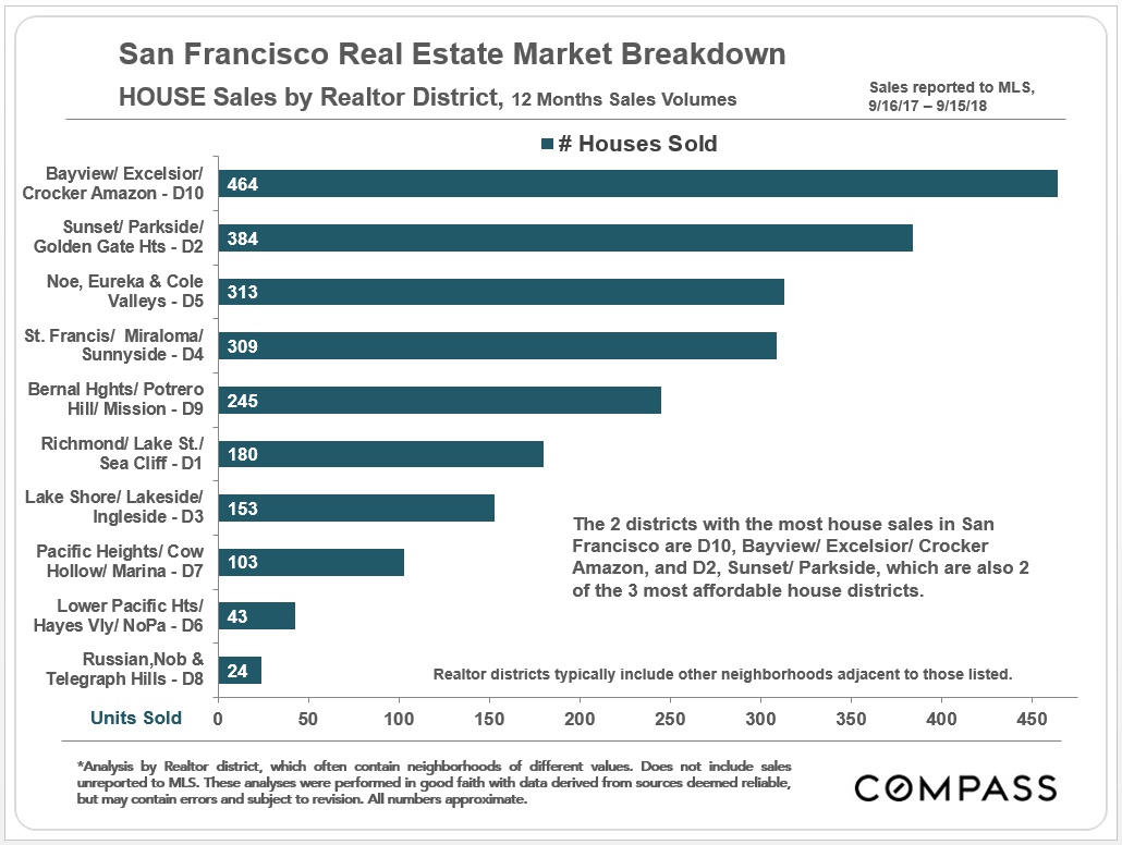
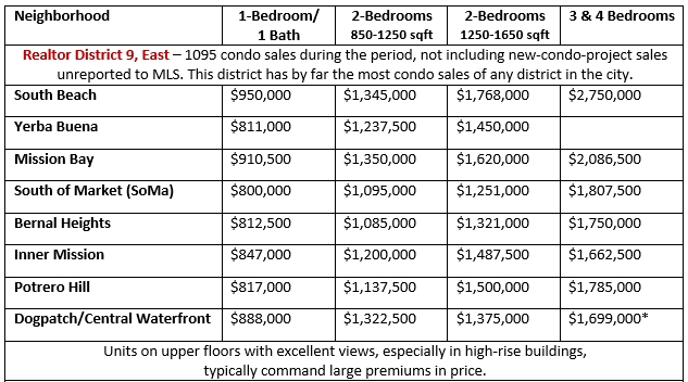
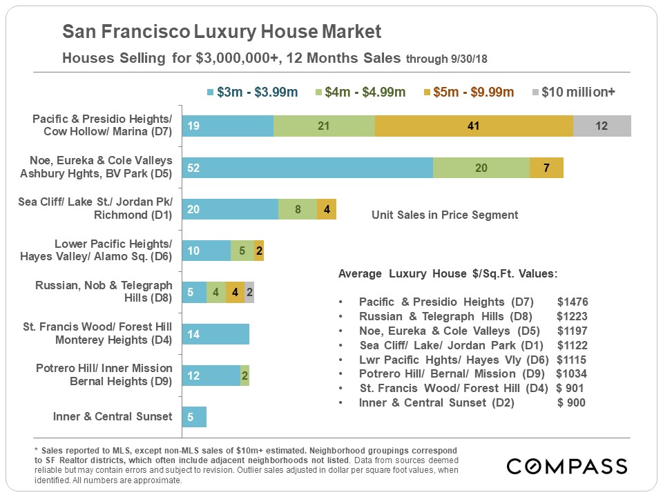
———————————————————— Price Tables by Neighborhood & Bedroom Count Below are selected excerpts from 10 pages of tables breaking down SF home sales over the past 12 months. If a field is left blank, it signifies that there weren’t enough sales for statistical analysis; if a price is asterisked, it means there were only 3 or 4 sales in the period. We are happy to provide the full collection of tables upon request. House Sales
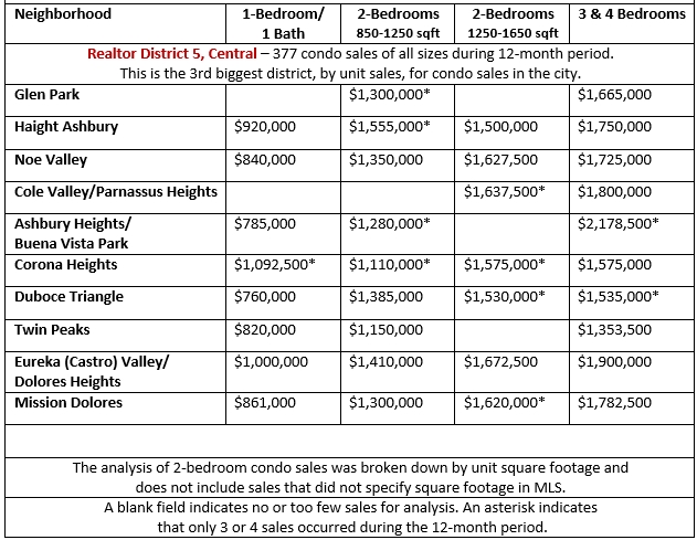
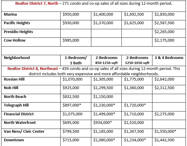
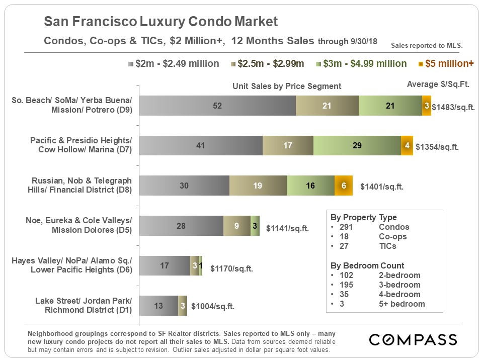
Condo Sales
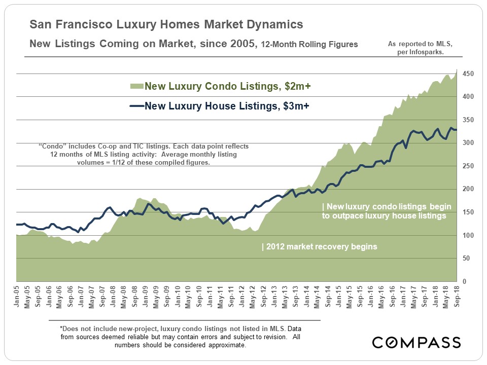
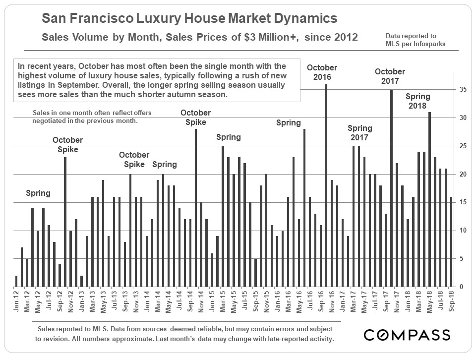
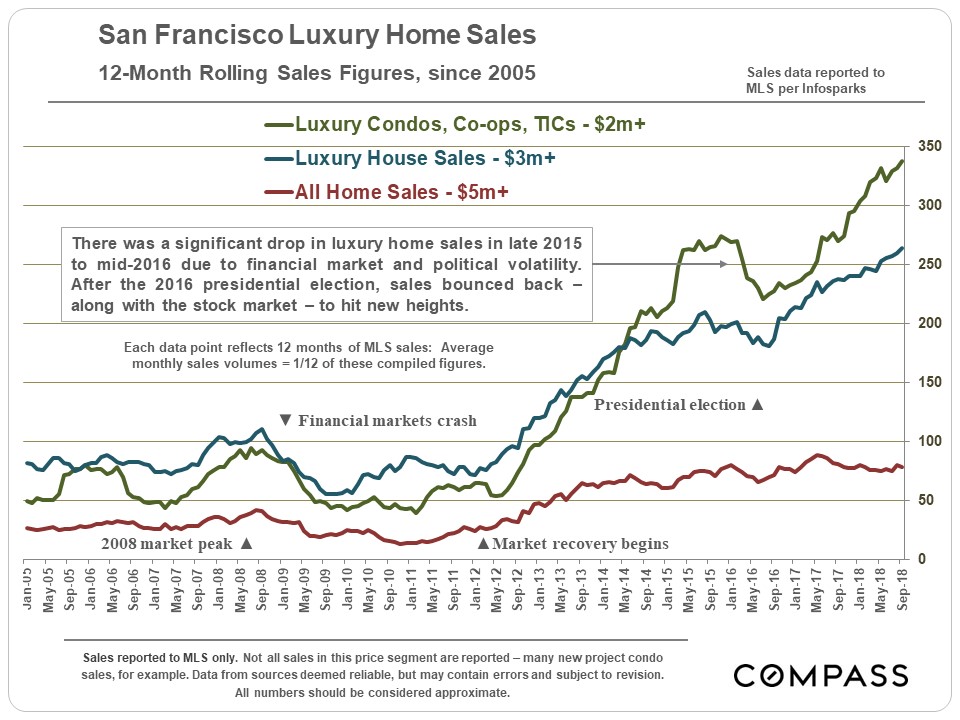
———————————————————— The Luxury Home Market As with the general market, September is typically a very important month for new luxury home listings and October a big month for sales. For the past 3 years, October has been the biggest month of the year for luxury house sales of $3m+. Even more so than the general market, the luxury market goes into a precipitous slowdown from just before Thanksgiving to mid-late January.
————————————————————
It is impossible to know how median and average value statistics apply to any particular home without a specific comparative market analysis.
These analyses were made in good faith with data from sources deemed reliable, but may contain errors and are subject to revision. It is not our intent to convince you of a particular position, but to attempt to provide straightforward data and analysis, so you can make your own informed decisions. Median and average statistics are enormous generalities: There are hundreds of different markets in San Francisco and the Bay Area, each with its own unique dynamics. Median prices and average dollar per square foot values can be and often are affected by other factors besides changes in fair market value. Longer term trends are much more meaningful than short-term. Compass is a real estate broker licensed by the State of California, DRE 01527235. Equal Housing Opportunity. This report has been prepared solely for information purposes. The information herein is based on or derived from information generally available to the public and/or from sources believed to be reliable. No representation or warranty can be given with respect to the accuracy or completeness of the information. Compass disclaims any and all liability relating to this report, including without limitation any express or implied representations or warranties for statements contained in, and omissions from, the report. Nothing contained herein is intended to be or should be read as any regulatory, legal, tax, accounting or other advice and Compass does not provide such advice. All opinions are subject to change without notice. Compass makes no representation regarding the accuracy of any statements regarding any references to the laws, statutes or regulations of any state are those of the author(s). Past performance is no guarantee of future results. © 2018 Compass
|
||||
|


>


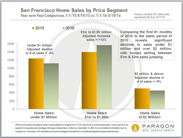
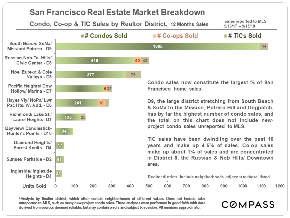
 Chart 2: San Francisco Condo Market Overview
 ————————————————————